The Story
Double Dutch was founded in February 2015 by two Dutch twin sisters. They manufacture premium, all-natural soft drinks intended to accompany quality spirits for the ideal balance between soda and spirit. However, the carefully crafted soft drinks can very well be enjoyed on their own.
Through their entrepreneurship master’s thesis at UCL, the twins embarked on a market research journey that led them to create Double Dutch. Offering a mixer with premium selected ingredients free from artificial flavours, colours, or preservatives, Double Dutch contains only 33 kilocalories, and a whole lot of flavour – satisfying consumers’ growing need to quench their thirst for lower calorie, less sweet and less sugary adult soft drinks.
The Design
With a design that their customers were saying was ‘too funky’, ‘too colourful’, and failed to communicate the naturalness of their drinks and the brand story, the de Haas twins hit a tipping point when a high-end customer claimed they loved their premium drinks mixer, but needed to find a way to serve it without showing the label. That’s when they knew it was time to re-design their brand.
“More and more people started saying that our labels were too similar to the competition, so that became a main objective of our re-design effort – to align better with the spirits market and be completely different than other sodas, while also telling our brand story,” says Joyce de Haas, co-founder at Double Dutch. The girls approached Design Bridge, an independent brand design agency in London, to create a brand vision that brought their objectives to life.The new brand image depicts two females relaxing over drinks in ‘perfect harmony’ with a strong graphic that draws the eye to the imagery with spot gold foiling and black ink on an off-white background. The brand name is now easy to identify on the label and the intriguing design sets the their label apart from competitors – all while communicating their brand story.
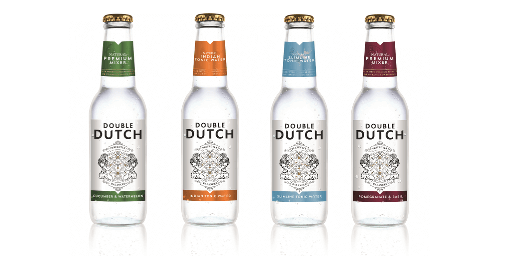
Choosing the Perfect Label
Next, the look and feel of the physical labels was another critical decision the girls needed to make. Again, their business objectives came to the forefront – differentiate Double Dutch from other premium soft drink mixers on the market and to create a look and feel that aligns with premium and small batch spirits. The de Haas’ approached us at with their new design and objectives.
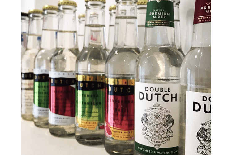
label.co.uk have worked with Double Dutch since they first launched their product, so we were really excited to be a part of the re-design. Since they really value customer feedback, we printed multiple test labels to see which ones everyone preferred. While our team liked the high-gloss samples, the labels with textured paper really communicated the premiumness of Double Dutch’s product. And, when put up to a vote, their customers agreed, with 10 out of 10 preferring the textured material of their new label, saying that no other drink mixer they stocked looked like that. That’s when they knew their new labels achieved their objectives.
The Future of Double Dutch
“We’re confident that our new label design is going to make all the difference,” says Joyce. “We’ve just won Richard Branson’s Virgin Startup Foodpreneur competition and look forward to a bright future.”
And, with adult consumers moving away from traditional mixers and towards adult soft drinks, a market valued at £163m and increasing by 4% annually, Double Dutch couldn’t have launched their re-design at a more perfect time.