Spot Colours - A Brief Introduction
Spot colours describe printing colours used in addition to the CMYK colour space. These colours can be used to print colours that are outside the four-colour printing space. From rich Pantone colours to delicate pastel shades to shimmering silver print – at label.co.uk you have the possibility to choose from different spot colours that achieve different effects and enhance your label. We explain how this works and which options of spot colour printing you have at label.co.uk.
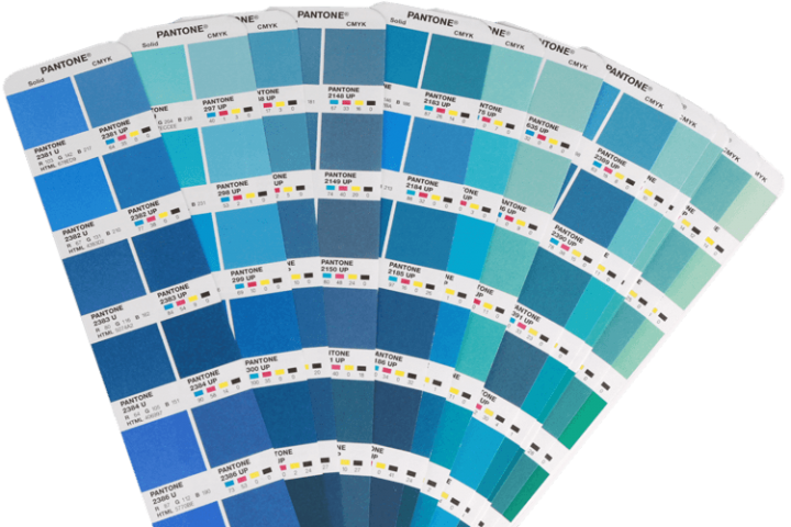
Pantone Spot Colours
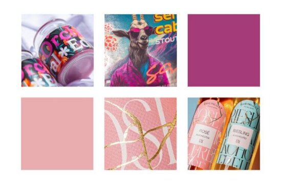
Pantone spot colours are an ideal marketing tool to give your brand a very individual design feature, such as a logo or lettering in a Pantone colour. There are almost 5,000 different Pantone colours to choose from, spread over two colour systems:
- Pantone Plus Series for graphic arts, printing and packaging.
- Pantone Fashion, Home & Interiors for product design
How Pantone Special Colours are Simulated at label.co.uk:
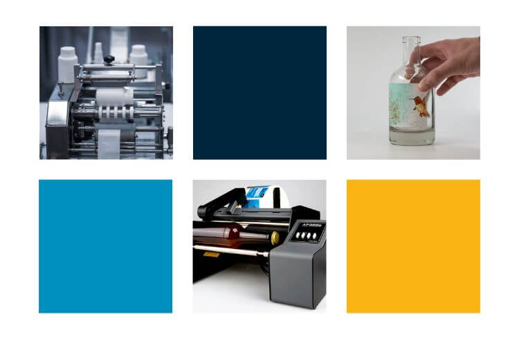
Digital printing is used at label.co.uk. As standard, we print in the four-colour model (CMYK), consisting of the four colours cyan, magenta, yellow and key (black). When printing Pantone colours, there are two possibilities: Simulating and printing with original colour.
Pantone colours can be simulated with the four-colour model (CMYK). However, the special Pantone colour tones are not matched one hundred percent, so we supplement the CMYK model with additional colours to create a so-called 7-colour model. This model is called an extended colour space and consists of CMYK + OVG: CMYK is supplemented by the colours orange, violet and green (OVG). In this way, the Pantone colours can be simulated and matched more accurately. Delicate pastel shades can also be simulated in this way.
However, the following applies: During printing, the colour can be set and adjusted as best as possible in order to come as close as possible to the original tone. However, we do not guarantee a 100% match with the original Pantone shade. For a 100% match, you have to print with the original Pantone shade, which is of course also possible at label.co.uk depending on the number of pieces, material, size and format, but can carry additional costs. We will be happy to provide you with a quotation.
To process your order as quickly as possible and hand it over to the printer: We ask you to convert special colours (if they are to be simulated and not printed originally) into CMYK in the print file. You are welcome to add the information that the colour is to be simulated in the comment field in the order.
Other Special Colours
In addition to Pantone colours and pastel shades, at label.co.uk you also have the option of choosing a silver print, printing with opaque white or even fluorescent colours.
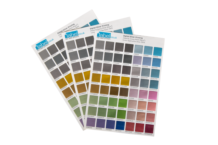
Digital Silver Printing
In silver printing, the CMYK colour model is supplemented by the so-called Silverinc, a silver colour. To achieve ideal colour results, this Silverinc is printed twice (200%). The desired colour is then printed on top of this in CMYK or CMYK-OVG. In this way, almost any desired colour can be produced as a metallic tone. Another tip on the choice of material: We recommend choosing a smooth material for silver printing, as the metallic effect is lost with textured uncoated papers.
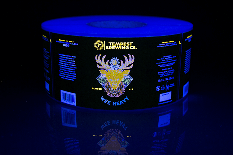
Fluorescent Inks/Invisible Ink
With fluorescent inks (invisible ink) as an eye-catcher, you create a very unusual effect that is not visible at first glance. Only in combination with so-called black light does the label become an eye-catcher: the special UV inks reflect the black light due to their chemical composition and start to glow. Invisible Ink is available in fluorescent yellow and blue. The fluorescent printing inks are used especially often for trendy drinks such as beer, mixed drinks or spirits to really stand out in bars and clubs.
Printing with Opaque White
The last variant of these colours is printing with opaque white. This is used when printing on non-white materials, such as transparent or metallic materials or natural papers that are not completely white, such as grass paper. Elements that are to be white later must then be applied with opaque white. Important: This white colour layer must be named HPI-White so that the press recognises it correctly. Our tutorials on the correct application of opaque white on metallic and transparent materials can also help you.
Nothing is impossible!
Additional information on simulating in the 7-colour model: Basically, any of the above combinations are possible, i.e. combining CMYK with OVG + white, CMYK + OVG + silver, CMYK + OVG + white + fluorescent colours or CMYK + white. There are almost no limits to your creativity! We will be happy to advise you on the implementation of your ideas and help you to make your label a very special eye-catcher.