22 October 2024
Are you afraid your products might drown in the sea of competing brands out there? One way to make sure that doesn’t happen is to create a unique and innovative product design.
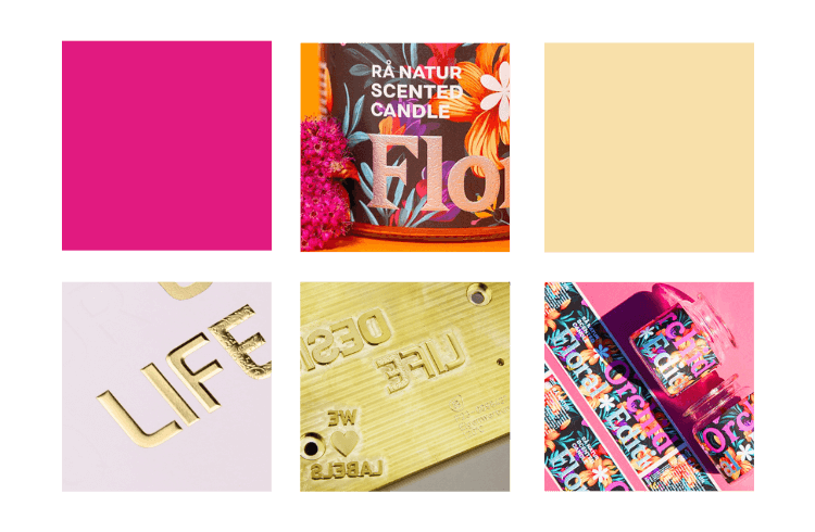
With a cohesive look across your product lines, you establish recognisable and memorable products. This is significant, especially in the spice industry. Most manufacturers’ assortments contain a wide variety of spices. For these product lines, a consistent, visually appealing label or packaging design is a true game-changer. We want to offer you some insights as well as advice regarding making your product designs cohesive.
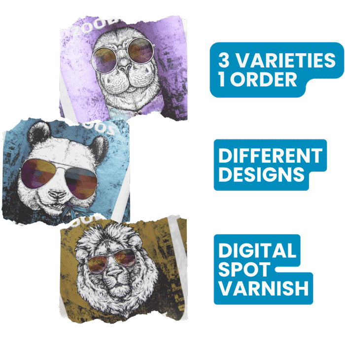
Sometimes it is convenient to order several varieties of a label with different specifications all in one order.
Digital printing allows you to do that. You can have different colours, designs, and positions for finishing touches in each variety. The only things that need to be the same across variations are shape, size and material.
Use Your Brand Identity to Create a Cohesive Design
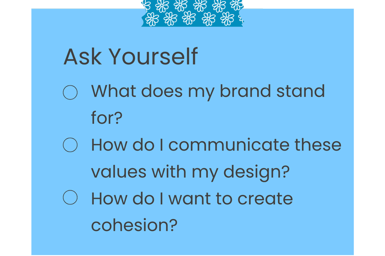
Your brand identity is what definitively sets you apart from other corporations. It includes the core values of your products, your services, and your performance (Ghodeswar). These values are the perks your brand offers, such as emotional and functional benefits. By translating these core values into your product design, you can visually communicate them to your (potential) customers. Thus, the appearance of your products establishes the essence of what your brand stands for and you can use the design to steer consumers’ expectations.
Now, you could even go a step further and design your packaging and labels in a way that makes your product lines not only expressive but memorable. These are the two components that most effectively support your products’ success on supermarket shelves (Ghodeswar). A sensible way to establish memorability is by creating packaging or labels with a red thread. Be it your brand’s logo, the colours of your corporate design, or maybe a catchphrase; by selecting certain elements and repeating them throughout your design, your packaging will be cohesive and create a strong sense of memorability (IanCW).
Tips for a Successful Label Design Across Product Lines
An easy way to establish a connection between product lines is by choosing and using certain font(s). Just think of brands such as Disney, Coca-Cola, Google, or MTV. Hearing these brands’ names will immediately conjure up an image in your mind. Of course, these are huge corporations and they are memorable for more than their fonts, nonetheless, typography is an integral part of their corporate design.
The same goes for colour schemes. Most brands have a small palette of colours they use to represent their identity. Whether it’s bright and playful or subdued and understated, you choose what works best.
Among the most obvious choices for an element of recognition is your brand’s logo. It should always be included in your label design. You want consumers to be able to associate the products they choose with your brand immediately. And the easiest, most sure-fire way to do that, is your company logo. In an ideal world, your logo uses some of the colours from your corporate design and you can use the rest of your palette to complement them with your design.
Once you have these features set, you can think about how to subtly distinguish between product lines. You could use different kinds of finishes, such as hot foil, spot varnish, or embossing.
TLDR: What to Include in Your Design:
- logo
- corporate colours
- signature fonts
- distinguishing elements (such as different hot foils, varnish, or embossing)
Practical Example
You have a range of spices (pepper, paprika, cinnamon etc.) that are all sold in the same container. To show that they are all from the same company, you use matching fonts, colours from your corporate design, your logo and the same shape and size of labels across variations. However, you use a different colour of hot foil to emphasise the type of spice: bronze for cinnamon, red for paprika, black for pepper, and so on. Not only does the hot foil give your labels a premium look, but it also visually differentiates the spices, while remaining cohesive.
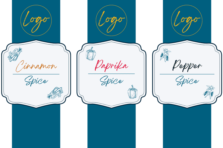
At label.co.uk we can print orders like this, all in one run. In our ordering process, you are given the option to choose the “No. of label designs” you want printed. Let’s say you do have cinnamon, paprika and pepper, that means you put a 3 in that field. Now you can go ahead and specify things such as shape, size and finishing touches. As total quantity you enter the overall number of labels you want to receive at the end (so all three designs combined). Later on in the ordering process, you can allocate how many labels of each design you want. It does not have to be split evenly, it is entirely up to you.
Conclusion
There are different aspects to keep in mind while designing your products. Your products should always represent your brand identity. For this purpose, include colours from your corporate identity palette in your designs. Additionally, choosing signature fonts is a way to establish a sense of memorability across product lines. You can use colours and fonts to express your products’ values and steer customers’ expectations.
So, channel all your creative energies and venture out to design the best, most innovative labels and packaging you can come up with. Maybe label.co.uk’s custom spice labels will help you with this enterprise.
Sources
Ghodeswar, Bhimrao M. “Building brand identity in competitive markets: A conceptual model.” Journal of Product & Brand Management, vol. 17, no. 1, 29 Feb. 2008, pp. 4–12, https://doi.org/10.1108/10610420810856468.
IanCW. “Memorability and B2B Marketing – One Marketing.” One Marketing – Marketing Concepts – Dangerous Ideas, 20 Feb. 2024, https://one-marketing.co.uk/memorability-and-b2b-marketing/.

Katharina Crusius
Marketing